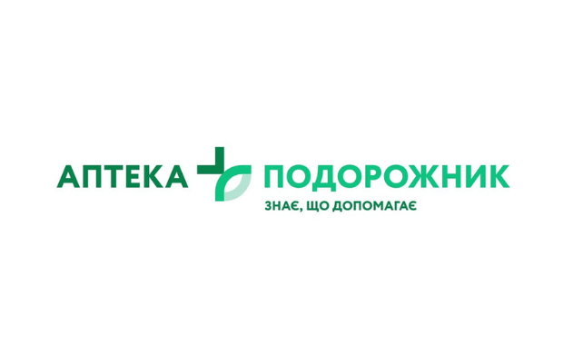
Podorozhnyk – Knows That Helps
Podorozhnyk is one of the TOP-5 pharmacy chains in Ukraine. The brand is growing rapidly, therefore, it needs an update that would reflect its fresh essence, advantages, and values.
The Publicis Ukraine team has rethought the brand identity and key message for the new Podorozhnyk. This is how the slogan appeared: “Podorozhnyk. Knows that helps”. It is based on two main brand advantages. On one hand, the brand has the necessary competencies, knowledge, experience, and resources to tell the client which drugs would be helpful in a specific case. On the other hand, Podorozhnyk cares about its client, offering high-quality drugs with no fakes. Also provides regular discount programs: “Quality available to everyone”, and provides additional services such as “Doctor at the pharmacy” etc.
Then the agency team updated the logo. Over the past years, Podorozhnyk has managed to build brand awareness, so when working with the visual component, it was important to maintain continuity, while reflecting updates and modernizing it. Thus, the recognizable medical cross and plantain leaf were visually rethought in the main green color. They merged into a single entity, where the significant element of the sign is linked to the corresponding word in the logo by color: the cross to the word pharmacy and the leaf to the Podorozhnyk. The logo has become concise and simple to understand, and the font has become lighter, neater, and more open.

